Typography Task 1: Exercise
27/08/2021 - 24/09/2021 (Week 1 - Week 5)
Sasilvia Cheong Pei Hoong / 0345031 / Bachelors of Design in Creative MediaTypography
Task 1 / Exercise
LECTURES
WEEK 1 / INTRODUCTION AND BRIEFING ( 27/09/2021 )
Mr. Vinod started our first class by explaining about how important is
the Facebook Typography group, he then proceeded to show us posts that we
have to look into from YouTube videos for tutorials to google sheet for
feedbacks. Soon after that Mr. Vinod gave us some time to set up our blog
for Typography so that he can check our blogs later on to make sure if we
got all the format and information correct.
Then, Mr. Vinod instructed us on our first task which is an exercise
where we have to do type expression and text formatting. We then suggested
some words that came up in mind and Mr. Charles made a poll in our
Facebook group so that we can decide on the top 7 words that will be
chosen in the end.
Lecture 0: Introduction to Photography
What is Typography?
Typography is the art and technique of arranging type to make written
language legible, readable and appealing when displayed.
Lecture 1: Development and Timeline
1) Early letterform development: Phoenician to Roman
- Writing were scratched into wet clay with sharpened sticks or carved with
a chisel into stone
- The uppercase forms are made up of a simple combination of straight lines
and circles.

Fig. 1.1 Development of Phoenician letters
Writing Direction:
- Phoenicians wrote from right to left
- The Greeks devised a literary style known as 'boustrophedon' (how the
ox ploughs), in which the lines alternated between reading from right
to left and left to right.


Carvers in Etruscan (and later Roman) times painted letterforms in
stone before inscribing them. Certain characteristics of their
strokes, such as a shift in weight from vertical to horizontal and a
broadening of the stroke at the beginning and end, were carried over
into carved letterforms.

Fig.1.3 Late 1st century B.C.E., Augustan inscription in the
Roman Forum, Rome.

Fig.1.4 Early letterform development
2. Hand Script from 3rd - 10th-Century C.E.
- The written version of square capitals can be seen in Roman
monuments
- Serifs is added to the finish of the main strokes of these
letterforms
- The variety of stroke width was achieved by the reed pen held at an
angle of approximately 60 degree off the perpendicular

- Compressed version of square capitals, rustic capitals allowed
for twice as many words on a sheet of parchment and took far less
time to write. The pen or brush was held at an angle of
approximately 30 degree off the perpendicular. Although rustic
capitals were faster and easier to, they were slightly harder to
read due to their compressed nature.

- Both square and rustic capitals were typically reserved for
documents of some intended performance.
Everyday transactions, however were typically written in
cursive hand in which forms were simplified for speed. We can see
here the beginning of what we refer to as lowercase letterforms.

- Uncials incorporated some aspects of the Roman cursive hand
- The broad forms of uncials are more readable at same sizes than
rustic capitals

Fig.1.8 4th - 5th century: Uncials
- Half- uncials mark the formal beginning of lowercase letterforms
- Replete with ascenders and descenders, 2000 years after origin
of the Phoenician alphabet

Fig.1.9 C. 500: Half-uncials
- Charlemagne, the first unifier of Europe since the Romans,
issued and edict in 789 to standardize all ecclesiastical
texts
- The texts are rewrote by using both majuscules (uppercase),
miniscule, capitalization and punctuation which set the
standard for calligraphy for a century

Fig.1.10 C. 925: Caloline miniscule
With the dissolution of Charlemagne's empire came
regional variations upon Alcuin's script. In northern Europe, a condense strongly vertical
letterform know as Blackletter or textura gained
popularity. In the south, a rounder more open hand gains
popularity, called 'rotunda'. The humanistic script in Italy is based on Alcuin's
miniscule.

Fig.1.11 c. 1300: Blackletter (Textura)
- Accurately mimicked the work of the scribe's hand -
Blackletter of northern Europe
- His type mold required a different brass matrix, or
negative impression, for each letterform


Lecture 2: Basic
Describing letterforms

Fig.2.1 Baseline , median, x-height
Baseline: The imaginary line the visual base of the
letterforms
Median: The imaginary line defining the x-height of
letterforms
X-height: The height in any typeface of the lowercase
'x'

Fig.2.2 Stroke
Stroke:
Any line that defines the basic letterform

Fig.2.3 Apex / Vertex
Apex / Vertex: The point created by joining two diagonal
stems ( apex above and vertex below)

Fig.2.4 Arm
Arm: Short strokes off the stem of the letterform,
either horizontal ( E,F, L) or inclines upward (K, Y)

Fig.2.5 Ascender
Ascender: The portion of the stem of a lowercase letterform that projects above the median

Fig.2.6 Barb
Barb: The half-serif finish on some curved stroke

Fig.2.7 Bowl
Bowl: The rounded form that describes a counter. The
bowl may be either open or closed.

Fig.2.8 Bracket
Bracket: The transition between the serif and the
stem

Fig.2.9 Cross Bar

Fig.2.10 Cross Stroke
Cross Stroke: The horizontal stroke in a
letterform that joins two stems together

Fig.2.11 Crotch

Fig.2.12 Descender
Descender: The portion of the stem of a
lowercase letterform that projects below the
baseline

Fig.2.13 Ear

Fig.2.14 Em / en
https://opusdesign.us/wordcount/what-is-the-difference-between-em-dash-and-en-dash/
Em / en: Originally referring to the width of
an uppercase M, and em is now the distance equal to
the size of the typeface (an em in 48 points, for
example). An en is half the size of an em. Most
often used to describe em/en spaces and em/en
dashes.

Fig.2.15 Finial
Finial: The rounded non-serif terminal to
a stroke

Fig.2.16Leg
Leg: Short stroke off the stem of
the letterform, either at the bottom of the
stroke (L) or inclined downward (K, R)

Fig.2.17 Ligature
Ligature: The character formed by the
combination of two or more letterforms

Fig.2.18 Link
Link: The stroke that connects the bowl
and the loop of a lowercase G

Fig.2.19 Loop
Loop: In some typefaces, the bowl
created in the descender of the lowercase G

Fig.2.20 Serif
Serif: The right-angled of oblique foot at the end of the stroke

Fig.2.21 Shoulder
Shoulder: The curved stroke that is not part of a bowl

Fig.2.22 Spine
Spine:
The curved stem of the S

Fig.2.23 Spur
Spur:
The extension the articulates the junction
of the curved and rectilinear stroke

Fig.2.24 Stem
Stem:
The significant vertical or oblique
stroke

Fig.2.25 Stress

Fig.2.26 Swash

Fig.2.27 Tail
Tail: The curved diagonal stroke at the finish of certain letterforms

Fig.2.28 Terminal
Terminal: The self-contained finish a stroke without a serif. This is something of a catch-all term. Terminals may be flat ('T' above), flared, acute, ('t' above), grave, concave, convex, or rounded as a ball or a teardrop
The Font

Fig.3.1 Uppercase letters

Fig.3.2 Lowercase letters

Fig.3.3 Small capitals
Small Capitals: Uppercase
letterforms draw to the x-height
of the typeface, Small Caps are
primarily found in serif fonts as
part of what is often called
expert set

Fig.3.4 Uppercase
numerals
Uppercase Numerals: Also
called lining figures, these
numerals are the same
height as uppercase letters
and are all set to the same
kerning width

Fig.3.5 Lowercase
numerals
Lowercase Numerals: Also known as old style
figures or text figures, these
numerals are set to x-height
with ascenders and descenders

Fig.3.6 Italic
Italic: Most fonts today are produced with a matching italic. Small caps, however, are almost always only roman. The forms in a italic refer back to fifteenth century Italian cursive handwriting. Oblique are typically based on the roman form of the universe

Fig.3.7 Punctuation,
miscellaneous
characters
Punctuation, miscellaneous
characters: Although all fonts contain
standard punctuation marks,
miscellaneous characters can
change from typeface to
typeface.

Fig.3.8 Ornaments
Describing Typefaces

Fig.4.1 Different
categories within the
typefaces
Roman: The letterform is so
called because the uppercase forms
are derived from inscriptions of
Roman monuments. A slightly lighter
stroke in roman is known as 'Book'
Italic: Named for fifteenth
century Italian handwriting on
which forms are based
Oblique: Conversely are
based on roman form of typeface
Boldface:
Characterized by a
thicker stroke than a roman
form. Depending upon the
relative stroke widths within
the typeface, it can also be
called 'semibold', 'medium',
'black', 'extra bold', or
super.
Light: A lighter stroke
than the roman form. Even
lighter strokes are called
'thin'
Condense: A version
of the roman form, and
extremely condense styles
are often called
'compressed'
Extended: An
extended variation of a
roman font

Fig.5.1 Radiography
in different
typefaces

Fig.5.2 Comparing
typefaces
- Range of attitudes, some
whimsical, some stately,
some mechanical, others
calligraphic some
harmonious and some
awkward
Lecture 3: Text
Tracking: Kerning and Letterspacing

Fig.6.1 Kerning and letterspacing
Letterspacing: Add space between the letters
Tracking: Addition and removal of space in a word or
sentence

Fig.6.2 Normal tracking, loose tracking and tight tracking
Formatting Text

Fig.6.3 Normal and loose tracking in a paragraph

Fig.6.4 Tight tracking in a paragraph

Fig.6.5 Flush left, ragged right
Flush left: Closely mirrors the asymmetrical
experience of handwriting. Each line starts at the same
point but ends wherever the last word on the line ends.
Spaces between words are consistent throughout the text,
allowing the type to create an even gray value.

Fig.6.6 Centered, ragged left and right
Centered: Imposes symmetry upon the text,
assigning equal value and weight to both ends of any line.
Because centered type creates such a strong shape on the
page, its important to amend line breaks so that the text
does bit appear too jagged.

Fig.6.7 Flush right, ragged left
Flush right: Places emphasis on the end of the lune
as opposed to its start.

Fig.6.8 Justified
Justified: Like centering, this format imposes a symmetrical
shape on the text. It is achieved by expanding or reducing
spaces between words and, sometimes, between letters.
Text / Texture

Fig.7.1 Anatomy of typefaces


Fig.7.3 Different typefaces 2
Leading and Line Length
Type size: Text type should be large
enough to be res easily at arms length
Leading: Text that is set too tightly
encourages vertical eye movement
Line Length: Appropriate leading for
text is as much a function of the line
length as it is a question of type size and
leading


Fig.8.1 Bad leading

Fig.8.2 Sample type specimen
sheet
Lecture 4: Text - Part 2
Indicating Paragraphs

Fig.9.1 Pilcrow

Fig.9.2 Line
Space (12pt)

Fig.9.3 Line
space vs
leading
Widows and Orphans

Fig.10.1 Widow and Orphan
Widow: A short line of typo left alone at the end of a
column of text
Orphan: A short line of type left alone at the start
of new column
Highlighting Text


Fig.10.2 Non-highlighted and highlighted text

Fig.10.3 Point size for highlighted text


Fig.10.4 Highlighted text
- Maintaining the left reading axis ( right example) of the text
ensures readability is at its best

Fig.10.5 Quotation marks
Quotation marks: Like bullets, can create a clear indent,
breaking the left reading axis

Fig.11.1 Headlines
Headlines: A head indicates a clear break between the topics within a section
Lecture 5: Understanding
Understanding Letterforms

Fig.12.1 Baskerville stroke
The uppercase letter suggest symmetry, but in fact it is not
symmetrical. It is easy to see the two different stroke weights of
the Baskerville stroke, more noteworthy is the fact that each
bracket connecting the serif to the stem has a unique arc

Fig.12.2 Univers stroke
The uppercase letter forms may appear symmetrical, but a close
examination shows that the width of the left slope is thinner than the
right stroke. Both Baskerville (previous) and Univers (Fig 12.2) demonstrate the
meticulous care a type designer takes to create letterforms that are both internally
harmonious and individually expressive.

Fig.12.3 Helvetica and Univers
The complexity of each individual letterform is neatly
demonstrated by examining the lowercase 'a' of two seemingly
similar sans-serif typefaces - Helvetica and Univers, A comparison
of how the stems of the letterforms finish and how the bowls meet
the stems quickly to reveal the palpable difference in character
between the two.
Maintaining x-height

Fig.12.4 Maintaining x-height
X-height generally describe the size of the lowercase
letterforms. Curved strokes, such as in 's'. must rise above
the median (or sink below the baseline) in order to appear
to be the same size as the vertical and horizontal strokes
they adjoin.
Form and Counterform

Fig.12.5 Form and counterform
When layers are joined to form words, the counterform includes
the spaces between them
Contrast

Fig.12.6 Contrast
The simple contrast produces numerous variations:
small= organic / large + machined: small + dark/ large
light
INSTRUCTIONS
Exercise (1) Task 1 : Type Expression
My Sketches

Fig.1.1 Sketches for the word "Terror" (2/9/2021)
For the word "Terror" I wanted to create thoughts and things that
people find intimidating or creepy. The first sketch was to represent
"ERROR" being bigger than "T" and it was taunting "T" with its
size and shadow. The second sketch represents scratch marks made by
creatures with big claws or some pattern made by a sharp object. For
the third sketch I tried to fill up the space with the word to make it
big and intimidating, and for the fourth sketch was inspired by
"Illuminati".

Fig.1.2 Sketches for the word "Bark" (2/9/2021)
I wanted to create an effect where the word "Bark" would look like a
dog barking intensively. For the first sketch I made the letter
"K" larger and sharper on the edges so that it looks like a dog
barking really sudden. The second sketch is meant to look like a dog
barking many times and then slowly you hear other dogs barking
together with it. The third and fourth sketch was to make it look like
the barking sound is very loud and sudden.

Fig.1.3 Sketches for the word "Space" (2/9/2021)
For my "Space" sketches I wanted to incorporate both space like
letters having spaces between them and space like the
galaxy.

Fig.1.4 Sketches for the word "Broken" (2/9/2021)
I wanted to make the word "Broken" look like it is falling apart,
separating from each other and getting tear up into pieces leaving
only partial of the letters behind.
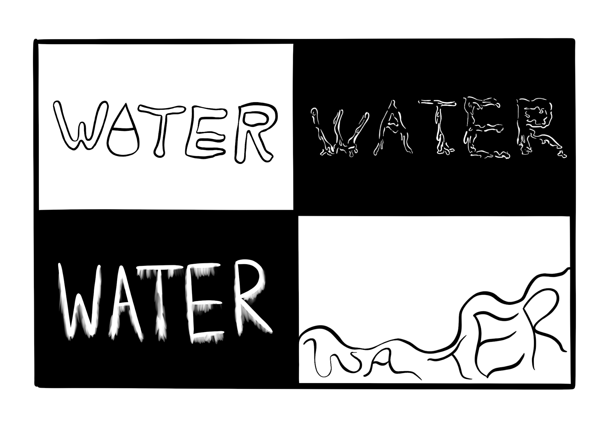
Fig.1.5 Sketches for the word "Water" (2/9/2021)
The first "Water" sketch was to make the letter "A" a water droplet
filled with water inside to make up for the line in the letter "A".
For the second sketch I sketched out water ripples in the form of
the word "Water". The third sketch was made to look like water
smudge, and for the fourth one It was inspired by the water at the
beach where water will slowly splash onto the shore.

Fig.2.1 Digitalization for text expressions (10/9/2021)

Final Text Expression

Fig.2.3 Final text expression digitalization JPEG (17/9/2021)
Fig.2.4 Final text expression digitalization PDF (17/9/2021)
Type Expression Animation
Mr. Vinod shared a video tutorial to us on how to animate type
expression. Where we are required to create frames in Adobe Illustrator
and animate in Adobe Photoshop.

Fig.3.1 First attempt (10/9/2021)
It was pretty confusing to me to create the frames in Adobe Illustrator but after a while I understood it. I was not satisfied on how my first attempt turned out as the letters jitters a lot when it is spacing.

Fig.3.2 Second attempt (10/9/2021)

Fig.3.3 Third attempt (19/9/2021)
During my third attempt I was figuring how to make the letters stay still and not make them move out of place.

Fig.3.4 Fourth attempt (19/9/2021)
After getting some advice from Mr. Vinod and my friend, I finally got the hang of it.
Final Animation
Mr. Vinod suggested adding more of the word "Spaces" into the animation
to show that there are more spaces around it. I then duplicated two
other "Space" words beside the center one and use back the same
animation technique I used in my fourth attempt.

Fig.4.1 Final animation timeline (12 frames) (19/9/2021)
Fig.4.2 Final Animated Type Expression "Space" GIF (19/9/2021)
Exercise (1) Task 2 : Text Formatting
I watched the video tutorials that Mr. Vinod provided and followed some
of the the ways Mr. Vinod does the kerning and tracking.
Fig.5.1 Text Formatting with Kerning (23/9/2021)

Fig.5.2 Second attempt before text formatting with kerning (24/9/2021)

Fig.5.3 Second attempt after text formatting with kerning (24/9/2021)

Fig.5.4 Second attempt after text formatting with kerning comparison (24/9/2021)
Fig.5.5 Text Formatting with Kerning PDF (24/9/2021)
After finishing the kerning and tracking I proceeded with watching
the next video about text formatting.

Fig.5.6 Layout 1 Text Formatting Exercise (23/9/2021)
Fig.5.7 Layout 2 Text Formatting Exercise (23/9/2021)
Fig.5.8 Layout 3 Text Formatting Exercise (25/9/2021)
Fig.5.9 Layout 4 Text Formatting Exercise (25/9/2021)
Fig.5.10 Layout 5 Text Formatting Exercise (25/9/2021)
Fig.5.11 Layout 6 Text Formatting Exercise (25/9/2021)
Fig.5.12 Layout 7 Text Formatting Exercise (25/9/2021)
Final Layout
Fig.5.13 Final Layout Text Formatting Exercise JPEG (25/9/2021)
Fig.5.14 Final Layout Text Formatting Exercise PDF (25/9/2021)
FEEDBACK
Week 1- E-portfolio
General Feedback: Choose typefaces wisely and do not use too many typefaces in our blog
to prevent the overall layout to be messy. Choose colour wisely for
our blog so that the words and background colours does not
clash.
Specific Feedback: Arrange the line breaker accordingly and make PDF file for module
information visible.
Week 2- Typefaces
General Feedback: The use of distortion for the word expression should be used at
minimum, distortion should be put at the end of the letter as
typeface distortion option is limited.
Specific Feedback:
1. For my 1st design for "Broken" I was advised to not use that method as it looks more like it is
erased.
2. The 2nd and 4th "Water" design was way to distorted so I was told
not to use it, as for my 3rd design it does not look like water it
looks more like frost.
3. All 4 of my "Terror" and " Bark" received good feedbacks
4. The "Space" design was overall good but the 4th one had some slight
illustration which will not be suitable.
Week 3- Test Expressions and Animation
General Feedback: Use as less illustration and distortion in this exercise as it is
supposed to be a simple design.
Specific Feedback: For my test expression "Terror" I was advised to change it as it
did not give out any terror meaning to it. Secondly, for the
"Broken" text expression I was told to explore more.
Week 4 - Animation
General Feedback: Make sure that your animation suits the meaning of the word that
your using.
Specific Feedback: My animation for the word "Space" jitters a lot and looks awkward to the eye
REFLECTIONS
Experiences
Throughout this exercise I have experiences some difficulties
especially in the animation process as I was not familiar with the
software functions and did not get what I wanted, but after getting
multiple advices and ways to solve it from Mr. Vinod and my friends I
was able to finish it and produce my final work. I found the shortcut
keys really helpful and saves up a lot of time. Other than that, I was a
bit weary when I started using Adobe InDesign as it was my first time
using it but watching the tutorials that Mr. Vinod provided has guided
me with ease.
Observation
When doing the text expression exercise observing the meaning of the
word and movement is very important. When using Adobe InDesign I had to
try out every single function on it to get used to it.
Findings
When working on sketch ideas for the text expression exercise I found it useful with searching up on real
life images on the given words so that patterns, emotion throughout the
pictures can be placed and used in the sketches. The internet like
YouTube and Google has provided me with extra knowledge on how to use
the softwares and had also solved the problems that I need answered
really fast and efficiently.
FURTHER READINGS

Fig.1.1 Typography, Referenced: A Comprehensive Visual Guide to the
Language, History, and Practice of Typography
Out of all the recommended book, I decided to read " Typography, Referenced: A Comprehensive Visual Guide to the
Language, History, and Practice of Typography".


Fig.1.2 Braille
This book is filled with type histories and designs throughout the
ages. I also found these two pages of braille from the
introduction really interesting.
Type History and Timeline

Fig.1.3 Letters carved on stones

Fig.1.4 By Nicole Jenson, 1470
Type letters has been evolving throughout history, from carving on
stones to having adjustable mold to enabled one letterform model
produced by a designer to be replicated thousands times. Printers
was first invented in the (1420-1480) where it was used to cut and
use fonts based on Roman rather than northern European Frakture
letterform.

Fig.1.5 By Rudolf Koch, 1924
This piece by Rudolf Koch in 1924 caught my eye as it somewhat
resemble the colour pallete of what indigenous people in America
wear. The calligraphy was written by Koch whose has multiple of his
designs becomes fonts.
REFERENCES
Fig.2.17 Ligature-
https://www.fonts.com/content/learning/fontology/level-3/signs-and-symbols/ligatures-1
Further readings-
Typography, Referenced: A Comprehensive Visual Guide to the
Language, History, and Practice of Typography, Allan Haley, Richard
Poulin, Jason Tselentis, Tony Seddon, Gerry Leonidas, Ina Saltz,
Kathryn Henderson with Tyler Alterman, February 2012.


Comments
Post a Comment