Design Principles Project 2: Sense of Place
12.10.2021 - 26.10.2021 (Week 8- Week 10)
Sasilvia Cheong Pei Hoong / 0345031 / Bachelors of Design in Creative Media
Design Principles
Project 2: Sense of Place
Lecture 7
Sense of Place (The Importance of Observation)
Solve problems with effective visual communication. Ranging from personal goals to community events, and from corporate
functions to world changing projects, all through creative, visual
communication means.
The importance of observation
-Attentive to your surroundings
- Pay attention to details
-Be analytical
Sense of place
- Think about the place you are in now, or a place you had spent some
time at previously, or, a place that had created a lasting memory in
you.
- How do you express your sense of that place
- Start by documenting your observations-photographs, diary, talking to
relevant people, etc.
TASKS
INSTRUCTIONS
Visual Research

Fig. 1.1 Jibaku Shounen Hanako-kun anime
The anime Jibaku Shounen Hanoko-kun has this really unique art style that I love so much the colour combinations, the contrast, the aesthetics all go so well with each other.

Fig. 1.2 Spirited Away
Studio Ghibli has created many anime films that gives off this dreamy vibe and leaves the viewers in disbelieve of how can such amazing places exist. One of the films that I really like is Spirited Away where this scene of the main character - Sen walking towards a immerged railway track with the bright blue sky and fluffy clouds . It makes us say " Wow.. I want to be there so bad."


Fig. 1.3 & 1.4 The art of Kaneko
The art of Kaneko has created a few pieces that I love. The colours used feels somewhat calming and nostalgic. There is almost this sense of harmony in their artwork where all the elements goes well together.

Fig. 1.5 by Demizu Posuka
The artist of one of my favorite manga Yakusoku no Neverland had created many mazing pieces and this is one of the one that I got inspired by. From the perspective, fish eye view, harmony and hierarchy is just amazing. The way they made everything plain and earthy coloured while the scrolls are bright neon colours is fascinating like is there some meaning towards the scrolls, are they an important expect to this piece?


Fig. 1.6 & 1.7 CassandraJean
I came across CassandraJean's work when I was struggling with the colour choices. It gave me a spark of light an inspiration towards the colours I am going for. I like how she used grey based colours and then slaps on a bright colour on and manages to make it looks like it glowing.
Visual Research- Photography


Fig. 2.1 & 2.2 Images of lake and sky in New Zealand
I had so much fun memories in New Zealand, the scenery there was just breathtaking it was like in a Studio Ghibli film. My favorite was the blue sky with fluffy clouds and how clear the water was. These two photographs were taken by me and I still can not believe that such place exist in the world.


Fig. 2.3 & 2.4 Image of the area around my fridge
It might sound weird but from time to time I like to lie down on my kitchen floor near my fridge and look up where my exact pov is fig. 2.3. The reason I lie down there is because the floor is very nice and cold and whenever my mom opens the fridge I am able to get that cold breeze from the small gap. Sometimes lying down there helps me soothes my mind while I look at the many magnets on my fridge thinking back at the memories we had from travelling.
Idea Exploration
Sketches

Fig. 3.1 First sketch

Fig. 3.2 Second sketch

Fig. 3.3 Third sketch
The arcade actually has quite some meaning to me as I spent a lot of time in arcades with my sister in Thailand my mom's home country. We always go to ones in the shopping mall where we played car games, street fighter, shooting basketball, air hockey and so on. Those were the memories we had no matter how old we are we will continue our trips to the arcade. It makes me feel sad that we were not able to go back to Thailand in so long due to the pandemic and experience this feeling of getting to be a child again.
Progress

Fig. 4.1 Picture of my fridge magnets

Fig. 4.2 Line art


Fig. 4.3 & 4.4 Pasting and adjusting the colour of the fridge
magnets
Since I am not able to draw all the magnets as I don't think I was mentally ready for it I decided to take a clear picture of the magnets, colour correct it and then distort it to fit the fridge.

Fig. 4.5 Greyscale
I tried doing a greyscale first since I was having a hard time picking out the colours.


Fig. 4.6 & 4.7 Testing out colours
I was testing out some colour combination and came across this galaxy looking colour style, but I do not think that it is suitable for this piece so I wanted to experiment the colours further.

Fig. 4.7 Drawing a gap on the bottom part of the fridge
After discussing my progress with Dr. Charles, I decided to draw a gap on the bottom part of the fridge .

Fig. 4.8 Testing out colours
I really liked how this looked as it looks like a vision and gave off a dream/ nightmare vibe to it. But my mom hated it and said it was too dark and scary so I went to look into more examples of background illustrations, colour palettes, real life images of spaces to get more inspirations from it.

Fig. 4.9 Base colours
I decided to change the line art colour of the background and kept the white line art to the clock, fridge and calendar to indicate that these elements are important.

Fig. 4.10 Adding shades and details

Fig. 4.10 Adding shades and details
I added shading, highlights, light for the fluorescents light, reflection on the bottom part of the fridge and cold air coming out of the fridge.

Fig. 4.11 Creating GIF frames
I did a frame by frame animation in Procreate where the clock moves every hour and cold air will be flowing our of the fridge. In the end I decided not to animate the calendars as I do not think that it will make much sense how it is swaying as there is no wind that comes through that area.

Fig. 4.12 Adding sound effects to animation in Adobe Premiere Pro
After animating the GIF in Procreate I went to Adobe Premiere Pro to add sound effects. I made the video two times longer than the original one so that it can loop. I added fridge sound and clock ticking sound that I downloaded from YouTube. I had a hard time exporting the video as it was my first time using Adobe Premiere Pro.
Software used
1. Procreate (Drawing, colouring and frame by frame animation for GIF)
2. Adobe Premiere Pro (Adding sound effects to animation)
FINAL OUTCOME

Fig. 5.1 Sense of Place Final JPEG (30/10/2021)
"Reminiscence of Lost Times"
Laying down on a cold kitchen floor, having the cold breeze from the freeze leaking out from a tiny gap, while looking up at the many magnets on the fridge, then looking up at the clock, again changing the view to the calendar on the right. I wonder "Huh...., where did all the time go?" "How long have we been stuck like this?" "When can we go back to travelling around the world like we used to?" "Will we be stuck like this forever?". All these questions popping up into my head makes me feel empty and sad, all the time that we had has pass by like a flick of a finger. All of our time for the pass two years has been taken from us like it has fallen into abyss, is there any hope left, can we turn back to all the lost times? Are opportunities coming?
This piece actually represent how I feel during the ongoing pandemic, somewhat sad in a way. Knowing that so much time has passed by where all the time we could had have travelling around the world or even in the country with family and friends are gone and can not be retrieved back. Every time I lay on my kitchen floor and staring up at the fridge magnets gives me this nostalgic memories that I spend travelling around the world every year collecting magnets like a trophy that we have been to this country before. The fridge magnets shows the places we had traveled to before. The clock and calendars indicates that time has passed. The fluorescent light shows hope while the fridge being slightly open with light and cold air coming from the fridge shows that there might be an open door and one day we will have the opportunity to be able to travel freely again. The colour choice actually shows the sadness and how overwhelmed I feel towards the situation.
Elements
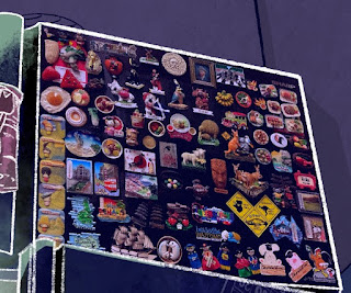
Fig. 5.2 Fridge magnets
Showing that I have travelled around the world, collecting magnets that filled up the entire top part of the fridge.

Fig. 5.3 Wall clock
Indicating that times has passed by. A small detail is that the hour and minute hand is pointing to my birthdate December 7.

Fig. 5.4 Calenders
Also something that represents that time has passed by as you can see that pages had been tore off from the small calendar and only a thin part of it is left like the year is almost over but what have we done during the pass few months?

Fig. 5.5 Fluorescent light
The light represents hope.

Fig. 5.6 Cold air from the fridge
The fridge being slightly open shows that small opportunities might be coming along my way.
Design Principles
- Emphasis: Fridge magnets
- Balance: Everything is evenly balanced and is not too crowded
- Contrast: The white line art for the clock, fridge and calendar
- Lines: The line to create the square tiles
- Movement: The cold air leaking through the small gap of the fridge
- Harmony: The different hues of purple used
- White Space: Negative space in the corner of the space
- Texture: A textured brush was used for shading and highlights

Fig. 5.7 Sense of Place Final GIF (31/10/2021)
Fig. 5.8 Sense of Place Final Animation and sound effect
Fig. 5.9 Sense of Place Final PDF (30/10/2021)
FEEDBACK
Week 9: The arcade and fridge sketches could work
Week 10:
General Feedback: Analyze the space, look at it on all perspective. Look at existing artworks
Specific Feedback: The contrast of the light is too high, the clock , fridge and calendar plays a more significant row, highlight to what is more important to the composition. Harmony is there, there must be a sense of hierarchy there where I want my main subject or main idea to be focus on. How I harmonize them and put them in a proper sequence, where the eye should move first
REFLECTION
I was actually a bit stress out about this project as I was very art blocked at that time and it took me days to come up with an idea of what to draw plus I am terrible at drawing spaces, background in general, I just was not able to think about anything and my mind was very restricted. But after the feedback session I had with Dr. Charles on Independence learning week I come to understand more about what sense of place is. Picking out colours was chaotic I could not find the right palette for it, I looked up hundreds literally hundreds of photographs and drawings to get that spark of creativeness back to me. But even though I was stressing out so much for this project I am very satisfied with the outcome I have.
REFERENCES
Fig. 1.1 Jibaku Shounen Hanako-kun anime
https://www.pinterest.com/pin/858780222700338151/
Fig. 1.2 Spirited Away
https://www.pinterest.com/pin/858780222700419110/
Fig. 1.3 & 1.4 The art of Kaneko
https://www.pinterest.com/pin/858780222700689573/
https://www.pinterest.com/pin/858780222700689576/
Fig. 1.5 by Demizu Posuka
https://twitter.com/DemizuPosuka/status/1223970430072975360
Fig. 1.6 & 1.7 CassandraJean
https://www.deviantart.com/cassandrajean/art/Tiger-Tracks-775248044


Comments
Post a Comment