Advanced Typography - Task 1: Exercises
28/3/2022 - 1/5/2022 (Week 1 - Week 6)
Sasilvia Cheong Pei Hoong / 0345031 / Bachelors of Design in Creative MediaAdvanced Typography
Task 1 : Exercises
LECTURES
WEEK 1
Introduction and Briefing
Mr. Vinod started the class by introducing us to the Facebook page so
that we will be able to navigate thing better. He showed us the lecture
playlist where we are able to watch all of our lectures from and take
lecture notes. We are also required top refresh our Adobe InDesign
knowledge as we will be using it for our first task. The eBooks can be
found in the files section, Download Typographic System book by Kimberly
Elam and read. Mr. Vinod gave us a short brief on our MIB. We are also
required to fill up our info into the feedback sheet. Then we watched
the lecture 1 video on typography system together.
Lecture 1: Typography Systems
Typographical organization is complex because the elements are
dependent on communication in order to function. Additional criteria
such as hierarchy, order of reading, legibility, and contrast.
Shape Grammar
Is a set of shape rules that apply in a step-by-step way to generate a
set or language of designs.
Axial System
All elements are organized to the left or right of a single
axis

Fig. 1.1 Example of axial system
Radial System
All elements are extended from a point of focus.

Fig. 1.2 Example of radial system
Dilatational System
All elements expand from a central point in a circular fashion.

Fig. 1.3 Example of axial system
Random System
Elements appear to have no specific pattern or relationship

Fig. 1.4 Example of random system
Grid System
A system of vertical and horizontal divisions.

Fig. 1.5 Example of grid system
An informal system of layered banding.

Fig. 1.6 Example of transitional system
Modular System
A series of non-objective elements that are constructed in as a
standardized units.

Fig. 1.7 Example of modular system
Bilateral System
All text is arranged symmetrically on a single axis.

Fig. 1.8 Example of bilateral system
WEEK 2
Lecture 2: Typographic Composition
Principle of Design Composition
Emphasis, isolation, repetition, symmetry and asymmetry,
alignment, perspective to name a few.

Fig. 2.1 Emphasis
The Rule of Thirds
A frame can be divided into 3 columns and 3 rows. The
intersecting lines are used as guide to place the points
of interest, within the given space.

Fig. 2.2 The Rule of Thirds
Typographic System
Most used system is the grid system, which is derived
from the gridded compositional structure of Letter
Press printing.

Fig. 2.3 Grid System
Post-modernist era in Typographical systems where
chaos, randomness and asymmetry were explored.
Legibility and readability were relegated to the back
seat however the best examples seem to combine two
seamlessly. Being exposed to Punk anti-establishment
thought and music. As such the asymmetry, random,
repetition, dilatational and radial systems began to
take root in the lexicon of designer.

Fig. 2.4 Example of post-modern typography
Environmental Grid
This system is based on the observation of an
existing structure or a collection of structures. An
extraction of critical curved and straight lines is
created.

Fig. 2.5 Example of environmental grid by Brenda
McMannus, of Pratt Inst.
Form and Movement
The placement of a form on my page, over many pages
creates movement. Whether the page is paper of
screen is irrelevant.

Fig. 2.6 Form and movement
WEEK 3
Lecture 3: Context and Creativity
Handwriting
- The first mechanically produced letterforms were designed to directly imitate handwriting.
- Basis or standard for form, spacing and conventions mechanical type would try and mimic.
- Shape and line of hand drawn letterforms are influenced by the tools and materials used to make them.
- Eg: Sharpened bones, charcoal sticks, plant stems, brushes, feather and steel pens all contributed tp the unique characteristics of the letterform.
- Letterforms were written on clay, papyrus, palm leaf, animal skins (vellum and parchment) and paper.

Fig. 3.1 Evolution of the Latin Alphabet
Cuneiform
Earliest system of actual writing, used in a
number of language between 34c. B.C.E. through
the 1st century C.E. The wedge form was the
result of pressing the blunt end of a reed
stylus into wet clay tablets. The cuneiform
characters evolved from pictograms. Cuneiform
was written from left to right.

Fig. 3.2 Cuneiform c. 3000 B.C.E.
Hieroglyphics
Egyptian writing system was the first link to
a future alphabetic system. To be used in
three ways:
- As ideograms, to represent the things they actually depict.
- As determinatives to show that the signs preceding are meant as phonograms and to indicate the general idea of the word.
- As phonograms to represent sounds that "spell out" individual words.

Fig. 3.3 Hieroglyphics 2613-2160
B.C.E.
The Phoenicians developed a phonetic
alphabet consisting of 22 letters. Has only
capital letters, written between two
guidelines to organize them into horizontal
rows. Greek was often read in a format known
as boustrophedon or "as the ox plows." One
row would read left to right and then switch
from right to left. Were drawn freehand, not
constructed with compasses and rule, and
they had no serifs.

Fig. 3.4 Early Greek / 5th C. B.C.E.
By the 4th century, Roman letters were
becoming more rounded, allowing for fewer
strokes and speedier writing.

Fig. 3.5 Roman Uncials
English Half Uncials
In England the uncial evolved into a more
slanted and condensed form.
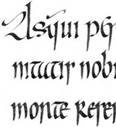
Fig. 3.6 English Half Uncials. 8th C.
Carolingian Miniscule
Capital at the start of a sentence, spaces
between words and punctuation. It was used for
all legal and literary words to unify
communication between the various regions of
the expanding European empire. It became the
pattern for the Humanistic writing of the 15th
century, this latter, in turn was the basis of
our lowercase roman type.

Fig. 3.7 Carolingian Miniscule
Black Letter
Gothic was the culminating artistic
expression of the middle ages, occurring
roughly 1200-1500. The vertical
supplanted horizontals as the dominants line
in architecture, the pointed arch replaced
the round arch of the Romans, the almond
shape, or mandorla, was preferred.
Blackletter is characterized by tight
spacing and condensed lettering with evenly
spaced verticals dominated the
letterform.

Fig. 3.8 Black letter 12-15 C. CE
The Italian Renaissance
Humanist scholars in Italy were slowly
reviving the culture of antiquity. The
renaissance embrace of ancient Greek and
Roman culture spurred a creative wave
through Italian art, architecture, literature
and letter form design.

Fig. 3.9 The Italian Renaissance
Humanist named the letterforms Antica. The form that was being applied to art an
architecture was directed toward letterform,
resulting in a more perfect or rationalized
letter.

Fig. 3.10 Antica
Printing had already been practiced in
China, Korea and Japan. The introduction of
movable type was introduced in the
1000-1100 CE.

Fig. 3.11 Movable type
Eastern developments in handwriting
Evolution of Middle Eastern Alphabets
Possibly influenced by the Egyptian Hieroglyphics
and Hieratic Scripts

Fig. 3.12 Evolution of Middle Eastern
Alphabets
From the Oracle bone to Seal Script to Clerical
Script, Traditional and Simplified scripts.

Fig. 3.12 Evolution of the Chinese script
Indus Valley Civilization (IVC) script
A yet undeciphered and seem to have a
logo-syllabic in nature.

Fig. 3.13 Indus Valley Civilization (IVC)
script 3500-2000 BCE
Earliest writing system developed in India after
the Indus script.

Fig. 3.14 The Brahmi script 450-350 BCE

Fig. 3.15 Pavalla script

Fig. 3.16 Pra-nagari (Nagari script)

Fig. 3.17 Kawi

Fig. 3.18 Incung

Fig. 3.19 Rencong

Fig. 3.20 Batak script

Fig. 3.21 Bugis script

Fig. 3.22 Javanese
script
Jawi
Arabic-based alphabet. Jawi
is introduced along with
Islam.

Fig. 3.23 Jawi from a
record of sale for a
female Batak slave to a
British
Programmers and type design
Vernacular scripts are being
produced by software giants
(Google)

Fig. 3.24 Programmers
and type design
WEEK 4
Lecture 4: Designing
Type
Why design another
typeface?
- Type design carries a social responsibility
- Type design is a form of artistic expression.
Adrian Frutiger
- 20th century Swiss graphic designer
- Typefaces contribution - Univers and Frutiger
- Frutiger is a sans serif typeface
Purpose
Create a clean,
distinctive and
legible typeface that
is easy to see from
both close up and far
away which is
extremely
functional.
Limitations
It needed to be
recognized even in
poor light conditions
or when the reader
moves quickly past a
sign.

Fig. 4.1 Airport Signage using
Frutiger
Matthew Carter
Is the son of Harry Cater,
Royal Designer for Industry,
contemporary British type
designer and ultimate
craftsman. Many of Carter's
fonts were created to
address specific technical
challenges, for example
those posed by early
computers like Verdana
(1996) for Microsoft.
Purpose
Tuned to be extremely
legible even at very small
sizes on the screen due in
part to the popularity of
the internet and electronic
devices.
Considerations/limitations
The Verdana fonts exhibit
characteristics derived from
the pixel rather than the
pen, the brush or the
chisel. Commonly confused
characters, such as the
lowercase "i, j , l"

Fig. 4.2 Verdana
typeface
In 1976, AT&T commissioned the design of a new typeface whose sole purpose would be to use it in their telephone directories. It has solve multiple technical and visual problems related to existing phonebook typeface, Bell Gothic.

Fig. 4.3 Comparison,
font vs printed
Edward Johnston
Is a creator of the
hugely influential
London "Underground"
typeface, which is later
known as "Johnston Sans"
(1916). He was asked to
create a typeface with
"bold simplicity" that
was truly yet rooted in
tradition. Johnston's
design was completed in
1916, combined classical
Roman proportions with
humanist warmth.
Purpose
London's
Underground railway
ordered a new typeface
for its posters and
signage from the
calligrapher Edward
Johnston.
Considerations/limitations
Johnston applied the
proportions of Roman
capital letters to his
typeface, so it was
rooted in history,
rooted in traditional
calligraphy. But it
has an elegance and a
simplicity that
absolutely fitted the
modern age.

Fig. 4.4 Earlier
versions reveal a
more fussy "w",
formed from two
intersecting "y" ,
a capital-style
"q"
General Process of
type design
1. Research
We should understand
type history and type
conventions. Know
terminologies,
side-bearing, metrics,
hinting. It is
important to determine
the type's purpose or
what it would be used
for, what different
applications in.
Examine existing fonts
that are presently
being used for
inspiration/ideas/
reference/ context/
usage patter/ etc.
2. Sketching
Using a traditional tool set
(brushes/ pens, ink and
paper) then scan them for
the purpose of digitization.
They are more confident with
their hands and have better
control using it. Others
sketch their typeface using
digital tool sets, such as
Wacom directly into a font
design software which is
much quicker, persistent and
consistent. But this can
sometimes impede the natural
movement of hand strokes.
3. Digitization
FontLab and Glyphs App are
professional software that
can be used to digitization
typefaces. Adobe Illustrator
is also used to design or
craft letterforms and then
introduce it into the
specialized font apps.
Attention should not only be
given to the whole form at
this stage but also to the
counter form. The
readability of the typeface
is heavily dependent on it.
4. Testing
Depending on the typeface
category (display type/ text
type) the readability and
legibility of the typeface
becomes an important
consideration. It is not
crucial if the typeface is a
display type, where
expression of the form takes
a little more precedence.
5. Deploy
Even after deploying a
completed typeface there are
always teething problems
that did not come to the
fore during the prototyping
and testing phases. Thus,
the task of revision does
not end upon deployment. The
rigour of the testing is
important in so that the
teething issue remain
minor.
Typeface construction
The grid in Roman Capital
consists of a square, and
inside it is a circle that
touches the lines of the
square in four places.
Within the square, there is
also a rectangle. This
rectangle is three quarters
the size of the square and
is positioned in the center
of the square. Thus, using
grids with circular forms
can facilitate the
construction of a
letterforms and is a
possible method to build/
create/ design the
letterform
Construction and
considerations
An important visual
correction is the extrusion
of curved and protruding
forms past the baseline and
cap line. This also applies
to vertical alignment
between curved and straight
forms. A visual correction
is also needed for the
distance between letters as
it is not possible to simply
place letters next to each
other with equal spacing
between them. The letters
must be altered to a uniform
'visual' white space. This
means that the white space
between the letters should
appear the same which is
called 'fitting' the type.
INSTRUCTIONS
Exercise (1) Task 1 : Typographic Systems
We were required to look into and create the 8 systems which are
axial, radial, dilatational, random, grid, modular, transitional and
bilateral in Adobe InDesign.
Requirements:
- Size: 200 x 200mm
- In addition to black we are allowed to use one other colour
- Graphical elements like ( line, dot, etc. ) can be used but limitedly
Explore the 8 systems using the following content:
The Design School,
Taylor’s University
All Ripped Up: Punk Influences on Design
or
The ABCs of Bauhaus Design Theory
or
Russian Constructivism and Graphic Design
Open Public Lectures:
June 24, 2021
Lew Pik Svonn, 9AM-10AM
Ezrena Mohd., 10AM-11AM
Suzy Sulaiman, 11AM-12PM
June 25, 2021
Lim Whay Yin, 9AM-10AM
Fahmi Reza, 10AM-11AM
William Harald-Wong, 11AM-12PM
Lecture Theatre 12
Sketches
Before starting the layout in InDesign, I head off with doing the
sketch first to give myself a rough idea of how I want my design to
look like.

Fig. 1.1 Sketch 1 (28/3/2022)

Fig. 1.2 Sketch 2 (28/3/2022)
Digitalization in InDesign
Axial

Fig. 2.1 Axial attempt 1 (29/3/2022)
On my first attempt on my axial layout I wanted to recreate a
piano where the bolded part with more words is the piano keys
and the bolded texts are the black keys. The title act as the
base of the piano. Since it was my first attempt, I felt like it
was lacking something so I went on and did more attempts.

Fig. 2.2 Axial attempt 2 (29/3/2022)
I was pretty satisfied with this layout as it looked neat and also
everything just went well together.

Fig. 2.3 Axial attempt 3 (31/3/2022)
I tried doing another attempt but I just do not find it
interesting.

Fig. 2.3 Axial attempt 4 (2/4/2022)
In the end I decided to use the layout from my third attempt
and add on the colour that I chose which was green, since the
choice of the green was on the darker side I chose to put a
black background to make it more contrast.
Radial

Fig. 2.4 Radial attempt 1 (29/3/2022)
I was kind of confused with this so I played around with the
circles and followed what like how I did in my
sketches.

Fig. 2.5 Radial attempt 2 (29/3/2022)
I did my second attempt and I placed a white filled circle in
the middle to create a blank space to show off the curves.

Fig. 2.6 Radial attempt 3 (2/4/2022)
I picked the second attempt to finalize and added the
colours.
Dilatational

Fig. 2.7 Dilatational attempt 1 (29/3/2022)
I had so much fun doing the dilatational attempts, my first
attempt was inspired by a vinyl.

Fig. 2.8 Dilatational attempt 2 (30/3/2022)
I was very proud of this honestly, took me countless of
attempts of readjusting the words over and over to make it
balance. As for this one, I was inspired by sound waves.

Fig. 2.9 Dilatational attempt 3 (2/4/2022)
Took the second attempt to finalize.
Random

Fig. 2.10 Random attempt 1 (1/4/2022)
I was very very lost with this, It looks so weird.

Fig. 2.11 Random attempt 2 (1/4/2022)
Tried again but did not like it as well :')

Fig. 2.12 Random attempt 3 (3/4/2022)
Had to take some time off of this one before continuing. The white box
behind the title is to balance everything off from the messy looking
background. I also tried to make the words look like its falling off. I
loved how this design play out.

Fig. 2.13 Random attempt 4 (3/4/2022)
Went to add on the colours and also added a circle to make the title
more contrast and brings the overall layout together.
Grid

Fig. 2.14 Grid attempt 1 (30/3/2022)
This came out pretty neat but I decided to try more attempts.

Fig. 2.15 Grid attempt 2 (30/3/2022)
Not a huge fan of it, felt too plain but also not? Just there
was something lacking.

Fig. 2.16 Grid attempt 3 (30/3/2022)
I was much more happy with this one, fashion magazines
totally helped me get an idea for this one.

Fig. 2.17 Grid attempt 4 (2/4/2022)
Added colour and also made the "punk" a different colour from
the row of words to give it a more impact on the
viewers.
Modular

Fig. 2.18 Modular attempt 1 (30/3/2022)
The top rectangle is thicker but shorter while the bottom one is
longer but thinner which balanced each other pretty
well. The huge title also gives an impact when you
first look at the layout.

Fig. 2.19 Modular attempt 2 (30/3/2022)
I got inspired by pianos again, since its's punk I wanted to add
more instruments or elements that is related with punk into the
design. Overall I loved how this one came out, it was totally
like how I visualize.

Fig. 2.20 Modular attempt 3 (31/3/2022)
I tried one more attempt, and now I'm confused between
picking attempt two or this.

Fig. 2.21 Modular attempt 4 (2/4/2022)
Tried them out with colour.

Fig. 2.22 Modular attempt 5 (2/4/2022)
Still love this one more since it looks more different than
the others and also looks more fun and vivid.
Transitional
Fig. 2.23 Transitional attempt 1 (31/3/2022)
Fig. 2.24 Transitional attempt 2 (31/3/2022)
This one came out much better. Definitely did not loose my mind doing this.
Fig. 2.25 Transitional attempt 3 (2/4/2022)
For colouring and finalizing I added a rectangle on the top
part of the title as I felt that it was empty and
unbalanced. Also changed the small boxes from a filled
colour to just the line so that it does not look too heavy
for the layout.
Bilateral

Fig. 2.26 Bilateral attempt 1 (1/4/2022)
This felt very in the face to me and it gives off flag
vibes.

Fig. 2.27 Bilateral attempt 2 (1/4/2022)
Tried a more subtle design and now I feel something missing,
maybe because everything in the design is light from the
rectangles and the fonts.

Fig. 2.28 Bilateral attempt 3 (1/4/2022)
In my third attempt I tried to utilize the straight line in
the letter "p" in the center to become the center point
of the design. Trying to get the line to fit perfectly with
the "p" was tougher than I expected, it either comes out
uneven or too small or too big.

Fig. 2.29 Bilateral attempt 2 (2/4/2022)
Coloured the third attempt.
- When I was finalizing the colours and layouts I realize that I did not change the hyphen to an en dash and also the am and pm to small capital so I had to change it all from the layouts.
Feedback (4/4/2020)
The axial and radial ones are good. For dilatational the leading
is too wide. The random is almost transitional but it works and
is interesting. The grid is all over the place, the attempt 1
one has promise but make sure to be careful about the leading
and alignment. The modular is graphic heavy. Transitional works
but try to reduce the gap between the dates. The leading space
for bilateral is too wide.

Fig. 3.1 Dilatational attempt after feedback (6/4/2022)
The leading for dilatational is narrowed down.

Fig. 3.2 Grid attempt after feedback (6/4/2022)
Changed to attempt 1 and narrowed the leading.

Fig. 3.3 Modular attempt after feedback (6/4/2022)
The huge rectangle block are removed so that it would not be
graphic heavy and changed the font colour to white and aligned
the words with each other.
Fig. 3.4 Transitional attempt after feedback (6/4/2022)
Narrowed down the gap space from before.

Fig. 3.5 Bilateral attempt after feedback (6/4/2022)
Cut the line for the letter "p" in the middle instead since
placing the words on the sides looked odd. The leading is also
narrowed down.
Final
Approximate time taken: 43 hours
(*Black outlines are added onto works with white backgrounds for easier view)

Fig. 4.1 Final Axial System JPEG (2/4/2022)

Fig. 4.2 Final Radial System JPEG (2/4/2022)

Fig. 4.3 Final Dilatational System JPEG (6/4/2022)

Fig. 4.4 Final Random System JPEG (3/4/2022)

Fig. 4.5 Final Grid System JPEG (6/4/2022)

Fig. 4.6 Final Modular System JPEG (6/4/2022)

Fig. 4.7 Final Transitional System JPEG (6/4/2022)

Fig. 4.8 Final Bilateral System JPEG (6/4/2022)
Fig. 4.9 Final Task 1 - Exercise 1: Typographic
Systems PDF (6/4/2022)
Fig. 4.10 Final Task 1 - Exercise 1: Typographic Systems
Grids and Guides PDF (6/4/2022)
Task 1: Exercise 2- Type and Play
Part 1: Finding Type
We were tasked to make a selection of image between man-made
objects or structures, and nature. Dissect and identify the
letterforms, only 4 letters are required.
- Selecting images
- Trace out the outline from the image.
- Identify different shapes and letterforms.
- Refine
- Reference with existing typefaces
Selecting Images
Before starting I searched for a few images that has
interesting and unique patterns.

Fig. 5.1 Spiderweb (10/4/2022)
-%20by%20deCode.jpg)
Fig. 5.2 Architecture design (10/4/2022)

Fig. 5.2 Mushrooms taken by me(10/4/2022)
I have been eyeing on my mom's container of mushrooms since week one, the patterns on them are just so mesmerizing.
Tracing the Outlines
I decided to go with the mushrooms and I traced out all the
outlines so that I can observe and identify the letterforms
better.

Fig. 5.3 Tracing the mushrooms (10/4/2022)
Identifying the letterforms

Fig. 5.4 Identifying the letterforms (10/4/2022)
I found a few letterforms (Z, V, L, E (x2), D, A, M,
R)

Fig. 5.4 Picking 4 letterforms (10/4/2022)
I picked out 4 of the letterforms that I thought has
the most potential which are (Z, E, D, A)
.jpg)
Fig. 5.4 The 4 letterforms (10/4/2022)

Fig. 5.4 Letterforms extracted (10/4/2022)
Through observing the extracted letterforms I have the word
"DAZE". The the letterforms appears to be sharp on certain
parts and has some weird unique ripple patterns on
some.

Fig. 5.5 Existing Typeface Reference- Bodoni Std Bold
(11/4/2022)
I decided to pick Bodoni Std Bold as my font has from my
extraction has a serif . I observed that the "A" is somewhat
similar to each other as one side of the "A" has a thicker
line while the other one is thinner. For the "Z" and
"E" the structure looks similar to each other as
well.

Fig. 5.6 Adjusting according to height (11/4/2022)

Fig. 5.7 Draft 1 (11/4/2022)
I tried refining the letters and adding the serif to
them but they turn out pretty weird except for the "E"
which I really like. So I am thinking about using the
"E" as a base for all the characters.

Fig. 5.8 Draft 2 (13/4/2022)
I tweaked the letters a bit so that it looks more
consistent with each other. The bottom part all has the
same curve. I also noticed that the top part of "E" was
not aligned with the bottom so I fix it. The "A" is
still a struggle to refine.

Fig. 5.9 Refine sketch (16/4/2022)
I was a bit stuck at this point so I started refining
through sketching it out first and try to get the
measurements right as well before going back to
Illustrator. I made the serif on the top left of the "D"
and "E" to look the same. Everything looks pretty good
to me for now, just the "A" needs a ton of refining work
to do.

Fig. 5.10 Draft 3 (16/4/2022)
After doing the vector I realized that the "D"
looks somewhat odd, maybe it needs a bit more
roundness. For the "A", it probably needs to be wider on
the bottom and of the line on the right side has to be
bigger and straighter. The "Z" and "E" are looking
better and I personally like them.

Fig. 5.11 Draft 4 (16/4/2022)
This time I refine the "D" to make it rounder. For
the "A" I changed the top serif to be the same as the
"D" and "E" and used the bottom part of "D" as reference
for the bottom legs of the "A", thought it still feels
off to me. The "Z" was further refine on the side so
that it does not look too boxy and has more curve to it.
The "E" stayed the same.

Fig. 5.12 Draft 5 (16/4/2022)
I changed the bottom part of the "A" once again and it
looks so much better and I am pretty much satisfied with
it. I also thicken the right curve for the "Z" so that
it looks more even.

Fig. 5.13 Draft 6 (17/4/2022)
Did some adjustment and refining on the details . I also
decided to change back the right side of the "Z" to be
boxy again since it looks more consistent with the
bottom left part of "Z" that way.

Fig. 5.14 Progress of the letterforms
(17/4/2022)
Feedback
After having a feedback session with Mr. Vinod I was
suggested to change the sharps points and make it
rounded like the top serif.

Fig. 6.1 Sharp points in the letterforms
(18/4/2022)
I then observed and circled all the sharp
points in red to know which one I need to change.

Fig. 6.2 Changed sharp points to round
(18/4/2022)
I used back the same rounded style on the top
serif for the sharp points so that it looks more
consistent.
Final
Approximate time taken: 23 hours

Fig. 7.1 Compiled process JPEG (18/4/2022)

Fig. 7.2 Original extracted letterforms compared to
the final type design JPEG
(18/4/2022)

Fig. 7.3 Final letterforms JPEG (18/4/2022)

Fig. 7.4 Letter "D" JPEG (18/4/2022)

Fig. 7.5 Letter "A" JPEG (18/4/2022)

Fig. 7.6 Letter "Z" JPEG (18/4/2022)

Fig. 7.7 Letter "E" JPEG (18/4/2022)
Fig. 7.8 Final letterforms PDF (18/4/2022)
Part 2: Type and Image
We were tasked to combine a visual with a
letter/word/sentence of our choice. Where the objective
was to enhance the interplay between the
letter/word/sentence and the selected visual. The text
must be woven into a symbiotic relationship with
the image.
I went on Pinterest to search for images that I liked and
I came across these interesting ones.
.jpg)
Fig. 8.1 Chosen image 1 (23/4/2022)

Fig. 8.2 Chosen image 2 (23/4/2022)
Attempts
For my first attempt I used the words "Gateway to hell"
because I feel that the red gloves symbolize a devil and the
mirror is like a portal to hell. The font ITC New
Baskerville Std Bold "Gateway" and "Hell" and then warp
was used to tweak the shape and then the opacity as well as
soft light blending mode was used to give it a shadow
effect. As for the word "To" I wanted to make it look like
it was drawn with blood so I used the font Gill Sans Bold
and then used liquify to smear and make dripping effects,
then I used layer style blending option to make the blood
look more realistic. For final touches to make the blood not
so solid, ripple was applied.

Fig. 8.3 First attempt (24/4/2022)
I then did the second image I chose which was multiple
concrete heads floating around and all of them had
different emotions which is the word that I am using for
this image. I decided to lay the alphabets of "Emotions"
all over the image and use different colours on them to
represent the different emotions. The font chosen was
Futura Std Bold. After laying all the alphabets out I
erase the parts that overlaps the heads.

Fig. 8.4 Second attempt before erasing (24/4/2022)

Fig. 8.5 Second attempt before erasing (24/4/2022)
Final
Approximate time taken: 8 hours
Fig. 9.1 Original image (25/4/2022)

Fig. 9.2 Final type and image (25/4/2022)
Fig. 9.3 Final type and image (25/4/2022)
FEEDBACK
Week 2 (4/4/2020) -
General Feedback: Fonts
size has to be at the range of 8-12. Avoid using too much
graphical elements. For axial, avoid doing it exactly at a 45
degree point.
Specific Feedback: Dilatational leading can be better. The random is almost
transitional but still good. Grid is all over the place, the attempt
ones look better, try to align it and change the leading. For
modular it is very graphic heavy, and it is not align with punk and
also too much leading. Transitional the gap space can be reduce.
Bilateral also leading space too wide.
Week 3 (11/4/2020) -
General Feedback: Identify the shapes of the letterforms and not just line them
out. Observe the texture and lines of the object
chosen.
Specific Feedback: Picture chosen is fine.
The extraction seem good. The challenge will be how to obtain
of what characteristics can be seen there. One is the inner
side of the mushroom where there is a lot of lines. Another is
the outer shape of the mushroom where there is wavy lines and
the top of the mushroom with patches of shapes.
Week 4 (18/4/2020) -
General Feedback: Be consistent with the letterforms and make sure there is
one similarities in the letterforms.
Specific Feedback: Very good, very consistent. There should not be a sharp
point, avoid it, there is no need for it. When you look
at a mushroom it is rounded, so why bother having a
sharp point. The serif above is what you should be
heading towards, not the bottom one there. If you want
to maintain some level of sharpness in the letterform,
you just bend it around a little bit and you will be
fine. Great job, texture wise, shape wise.
Week 5 (25/4/2020) -
General Feedback: Try to mimic the texture of the image as much as you
can. Avoid going for sharp and clear outlines as it does
not make it look blended well with the
image.
Specific Feedback: The red rubber latex glove and the effect gives off
American Horror Story vibes. The blood and shadow is
cool, go for the first one. Heads are nice in the
second one.
REFLECTIONS
Experiences
In exercise 1, I felt that coming up with creative ideas for
certain systems was tough like that was something restricting
me. Even when sketching for them was hard, but I kept looking up
for examples to try getting ideas for it and ideas slowly pops
up into my head one by one. I felt that doing a thumbnail sketch
before actually going hands on in InDesign is way much better as
I might mess up in InDesign and it will take forever to fix it.
Honestly finding the picture for finding type went better than I
expected since I had my eyes locked on my mom's mushroom for
weeks. Tracing them out took way more time because the mushroom
had a lot of different patterns and texture which was so fun to
extract alphabets out. Refining it was hard work as I had to be
very consistent of the typeface and needed to make sure that it
does not loose its mushroom essence. The type and image exercise
was my favorite one so far since I love using Photoshop. Being
able to modify and layout the words freely was so refreshing to
do. I also loved using effects and making the words as realistic
as possible to match the image chosen.
Observation
I had a mistake where I forgot to change the hyphen to en dash
because I thought they looked the same, but after I looked closely
and compared them en dash is slightly longer and balance everything
out better. I also forgot to change the am and pm to small capital
and after I changed them it looked way much better. Adjusting the
kerning between the letters helped a lot with how the words looked
as they are not as cramp and tight. The leading also was something I
had to focus more on as I tend to space it too wide. Alignments as
well, after adjusting and focusing on all those aspects it can
surely help make a layout look so much better. Picking a right
colour is also important, as dark colours might blend in too much
with the black and light colours will not be visible. Observing and
understanding the form of the mushroom was very important, as there
are wavy patterns and lines, making sharp points just throw the part
of it being a mushroom since mushroom are rounded of the sides. For
the type and image exercise, I found that it is so much like editing
photos where you try your best to match the foreign image to the
base one. Observing how the texture on the original image is and
applying it to the words is very important as it helps to make your
word and image look one.
Findings
I found that learning how all
these systems works sure help makes a layout better. It does not
restrict your creativeness as much as I thought it would, it
actually makes you explore more on the possibilities of designs that
you can create within that limit. I found that creating font can be
inspired by anything from foods, trees and even chairs! It is just
up to your creative thinking skills to be able to extract that form
out and refine it to something better. I found that wanting to make
something that looks more realistic and solid requires the effect of
using shadows and highlight and not necessary using 3D. It is like
painting an image where you add lots and lots of shading to make the
part look more realistic.
FURTHER READINGS

Fig. 1.1 Typographic System by Kimberly Elam (28/3/2022)
I was genuinely confused on what all these systems are
about but this book made me understand it way better. From the
images and examples it has provided to the detailed
explanations. When I am at lost and totally clueless of what I
had to do I kept on going back and looking at it for reference
and ideas, which helped a lot.

Fig. 1.2 Radial system (Page 43 )
I had no idea how radial worked at the first place, I
thought there was some kind of function in InDesign that
would make it much easier. But I found out it was created by
having a circle as a based and slowly aligning the words
close to the circle to create the patterns. It is like
drawing the sun as what I thought of.

Fig. 1.3 Random system (Page 77)
Random system was confusing, but after looking at
multiple references from the book I started getting
ideas on how it should look like. I also learned that
texturing is important where you layer words over words
to create the repetitive texture.

Fig. 1.4 Transitional system (Page 110)
When I was having trouble with the "fire" I was
making, I tried to look up on transitional system and
it gave me understand that transitional can also mean
by stacking up the words and giving it somewhat of a
flow to it.

Fig. 1.5 Modular system (Page 130)
Looking through the references of modular system made
me realize that different shapes makes a huge
different on the overall look. For example a square
can make it look neat and professional while circles
are playful and exciting to look at.
REFERENCES
Fig. 1.1-1.8 Example the systems
From week 1 lecture slides
Fig. 2.1-2.6 Typographic composition
From week 2 lecture slides
Fig. 3.4 Early Greek / 5th C. B.C.E.
https://www.olon-chronos.gr/ancient-greek-alphabetical-numbers.html
Fig. 3.7 Carolingian Miniscule
https://port.sas.ac.uk/mod/book/view.php?id=1121&chapterid=654
Fig. 3.8 Black letter 12-15 C. CE
https://blogfonts.com/black-letter.font
Fig. 3.1-3.24 Context and creativity
From week 3 lecture slides
Fig. 4.1-4.4 Designing Type
From week 4 lecture slides
Exercises
Fig. 5.1 Spiderweb (10/4/2022)
https://www.walesonline.co.uk/news/uk-news/14-species-spider-uk-could-21500274
Fig. 5.2 Architecture design (10/4/2022)
https://www.pinterest.com/pin/223350462744218163/
Further Readings
Fig. 1.1 Typographic System by Kimberly Elam (28/3/2022)


Comments
Post a Comment