Advanced Typography - Task 3
30/5/2022 - 27/6/2022 (Week 10 - Week 14)
Sasilvia Cheong Pei Hoong / 0345031 / Bachelors of Design in Creative MediaAdvanced Typography
Task 3- Type Exploration and Application
LECTURES
Lecture 1-4 : Advanced Typography - Task 1: Exercises
INSTRUCTIONS
Task 3: Type Exploration and
Application
For task 3 we are given the option to either
develop a font to solve a problem or be a part
of a solution in the area of our
interest such as graphic design, animation, new media,
entertainment design, etc or explore the use of
typeface to understand its existing
relationship, identify areas that could be improved upon, and
explore possible solutions or combinations that
may add value to the existing
typeface.
The end outcome could be a designed font and its
application which can be manifested into any kind
of format related to the issue being solved or
explored: animation, 3D, print, ambient,
projection, movie title or game title, use of
different material, etc.
Proposal
I came up with 3 ideas for my proposal and compile
them into a google slide:
Fig. 1.1 Task 3 proposal (28/5/2022)
Inspiration
After receiving feedback from Mr. Vinod where I
have to have the font I am creating to be relevant
to the artwork I create. Mr. Vinod suggested ideas
like spiders, sharp pointy shapes, and anything associated with gothic. So what came
up in my mind was the words heavy metal and cults
so I went on Pinterest to get inspired by cult
inspired fonts.

Fig. 2.1 Inspiration 1 (28/5/2022)

Fig. 2.2 Inspiration 2 (28/5/2022)

Fig. 2.3 Inspiration 3 (28/5/2022)

Fig. 2.4 Inspiration 4 (28/5/2022)

Fig. 2.5 Inspiration 5 (28/5/2022)
Sketches
After looking at inspirations I went onto
Procreate to do my sketches, I made my
sketches extra clean because I find it easier
coming up with ideas by drawing them out than
straight away digitalizing it in Illustrator.
For my typeface design, I went with the pointy
shapes on the bottom and top of the typeface
and some parts of the typefaces have vertical
and curved cuts on them.

Fig. 2.1 Sketches for alphabets
(4/6/2022)

Fig. 2.2 Sketches for numbers and
punctuation (4/6/2022)
Digitalization
I started digitalizing the letter and
numbers, I was somewhat struggling with
some of the letters so it took some time
to create them. I also decided to pull the
letter "C", "G", "O" and "Q" so that
they will be the same size as the other
letters. I also made some changes to a few
letters so that it looks more consistent
and align with each other. I changed the
middle part of the letter "A" so that it
aligns with the middle part of the other
letters. The end part for the letter "J"
was changed to have a sharp point. The
letter "Q" also had a makeover as I felt
that the sketch one looked bland so I
added a intersect line in it. Other
changes are the sizes and the cut out
lines and curves.
I was only able to make a portion of the
digitalization for week 12
feedback.

Fig. 3.1 Draft 1 of alphabets
digitalization (11/6/2022)

Fig. 3.2 Draft 1 of numbers and
punctuation digitalization (11/6/2022)
After receiving feedback from Mr.
Vinod, I changed some of the
characters design. For the "C", "G",
"O" and "Q" I was told that it
looked very odd stretched out and also
that is should be shorter than the
sharp points on the other letters.
Changing that it made the letters
round again which was way better than
before. The letter "J" was also cut
short so that it does not have too
much counterspace. The sharp ends of
the letter "K" and "R" are pulled down
so that it is not short and awkward
looking. Other than that I suffered a
lot making the letters "S", "V", "W",
"X" and "Y".

Fig. 3.3 Draft 2 of alphabets
digitalization with guides
(18/6/2022)
I also completed the numbers and
punctuation.
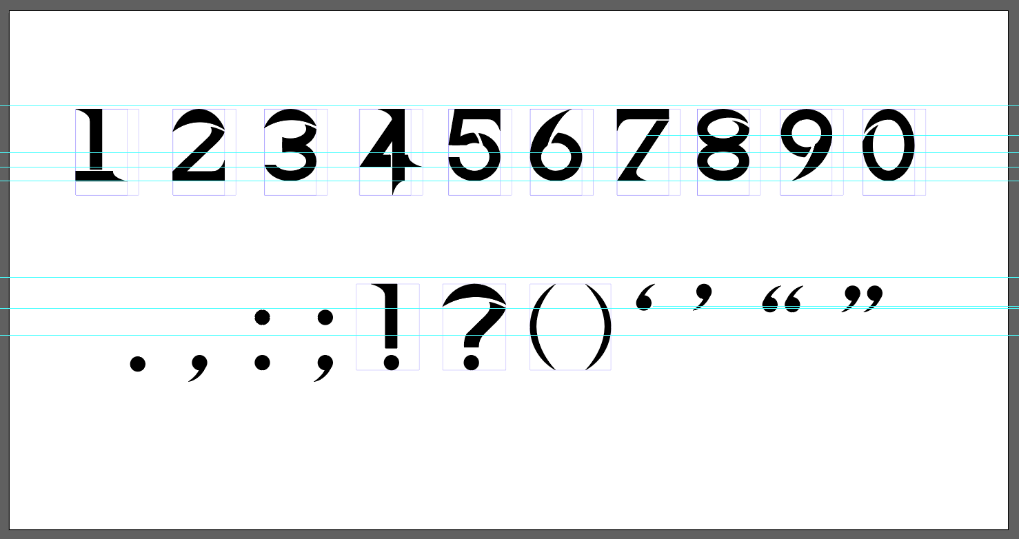
Fig. 3.4 Draft 2 of numbers
and punctuation digitalization
with guides (18/6/2022)
These are the elements I used
to construct my letterforms,
the circles are used to create
the curve cuts and the small
rectangle box is for the
vertical cut. For the curve
cuts, the circle sizes vary
for each letter.

Fig. 3.5 Elements used to
construct the fonts
(18/6/2022)

Fig. 3.6 Draft 2 of
alphabets
digitalization
(18/6/2022)

Fig. 3.7 Draft 2 of
numbers and
punctuation
digitalization
(18/6/2022)
Generating the font
in Font Forge
This is where the
pain happens, I
started out by
looking at the 2mins
font forge tutorial
video provided in
Kreatif Beats. After
exporting all of the
vectors into SVG
files I imported
them into font
forge. When I did
that my fonts were
all the same height
and the ascender and
descender lines were
all not cooperating
with me. I tried
looking up for
solutions and I was
not able to find
anything.

Fig. 4.1
Converting
vectors into
SVG file
(18/6/2022)
I got
frustrated,
had a mental
breakdown,
realize I
didn't have
time for a
mental
breakdown then
continued
looking for
solutions.
Then I came
across these 2
videos which
saved
me.
Fig. 4.2
Converting
vectors into SVG
file
(18/6/2022)
Fig. 4.3
Converting
vectors into SVG
file
(18/6/2022)

Fig. 4.4
Separating
each vector
onto
individual
artboards
(19/6/2022)

Fig. 4.5
Adjusting
vector to
ascender and
descender
lines
(19/6/2022)
I adjusted the
overall letter
height to
1000em and
descender
height to
167em
following what
I did in
Illustrator.

Fig. 4.6
Adjusting
the
overall
letter
height and
the
descender
height
(19/6/2022)
Then I
adjusted the
right line to
fit my
letter.

Fig. 4.7
Adjusting
right line
(19/6/2022)
I
encountered
another
problem
here, font
forge only
gave one
slot for
the single
and double
quotation
marks so
it either
using only
the left
single
quotation
mark or
the right
single
quotation
mark and
also
either the
left
double
quotation
mark or
the right
double
quotation
mark. I
tried
finding
solutions
on how to
solve it.
The
internet
said we
have to
reencode
the slots
but I
tried for
hours and
it did not
work so I
decided to
announce
that these
four
quotation
marks are
dead to
me.

Fig.
4.8 RIP
quotation
marks
(19/6/2022)
After that
mess, I
went on
adjusting
the width
metrics
for the
letters,
numbers,
and
punctuation.

Fig.
4.9
Width
metrics
(19/6/2022)
After
11
hours
of
figuring
out
how to
use
font
forge,
I
finally
was
able
to
generate
it.

Fig.
4.10 The
font in
individual slots
(19/6/2022)

Fig.
4.11
Generated
font
(19/6/2022)
Application
For my application, I decided
to apply the fonts to my
artworks and also do some
self-promoting for my art
account which is somewhat like
branding myself.
My Instagram art
account: https://www.instagram.com/kaenhibana/
My Instagram art account
username is not my real name
but an alternative name I
created which is "Kaen
Hibana", it's just a
translation from Japanese
where Kaen means flame and
Hibana means spark. I had a
liking for fire, though I do
not know why.

Fig. 5.1 My art account
(19/6/2022)
I placed the fonts onto my
artwork and made them like art
posters, artbook covers, and
also merchandise which will be
useful for me in the future
since I am planning to open an
art shop to sell my artworks.
Other than that, I will be
using the fonts in the future
as well to create a commission
poster for my commissions
pricing list.
Applications:
1. Art posters
2. Artbook cover
3. Art posters mockup
4. Artbook mockup
5. Pin buttons mockup
6. Stickers mockup
#1 Art posters

Fig. 5.1 Art poster "Lady
with Red Eyes"
(19/6/2022)

Fig. 5.2 Art poster
"Lurking Lotus"
(19/6/2022)

Fig. 5.3 Art poster "Haywire"
(19/6/2022)

Fig. 5.4 Art poster
"Reminiscence of Lost
Times" (19/6/2022)

Fig. 5.5 Art poster "He is mine.
He can't leave me"
(19/6/2022)
#2 Artbook covers

Fig. 6.1 Artbook cover "Suffocate- 7
stages of grief: Shock"
(19/6/2022)

Fig. 6.2 Artbook cover "Suffocate- 7 stages of
grief: Denial"
(19/6/2022)

Fig. 6.3 Artbook cover "Suffocate- 7
stages of grief: Anger"
(19/6/2022)

Fig. 6.4 Artbook cover "Suffocate- 7 stages of
grief: Bargaining"
(19/6/2022)

Fig. 6.5 Artbook cover "Suffocate- 7 stages of
grief: Depression"
(19/6/2022)

Fig. 6.6 Artbook cover "Suffocate- 7 stages of
grief: Acceptance"
(19/6/2022)

Fig. 6.7 Artbook cover "Suffocate- 7 stages of
grief: Grief"
(19/6/2022)
#3 Merchandise
Mockup file used
for art
poster:
https://mockups-design.com/free-poster-mockup-2/
Mockup file used
for artbook:
https://mockups-design.com/free-book-mockup-5/
Mockup file used
for pin
buttons:
https://mockups-design.com/free-pin-button-mockup/
Mockup file used
for
stickers:
https://mockups-design.com/free-round-sticker-mockup/

Fig. 7.1 Art poster "Haywire"
mockup (20/6/2022)

Fig. 7.2 Art poster "Reminiscence of Lost
Times" mockup
(20/6/2022)

Fig. 7.3 Artbook
"Suffocate- 7
stages of grief:
Shock"
mockup
(20/6/2022)

Fig. 7.4 Pin buttons
mockup (20/6/2022)

Fig. 7.5 Sticker
mockup (20/6/2022)
Application after
feedback
After receiving feedback from Mr. Vinod I made the type larger so that the star is not the visuals but the type. As for some of the drawings were way too bright and it disrupted the existence of the type, I decided to edit the drawings to make them darker so that the type would pop out.
#1 Art posters

Fig. 8.1 Art poster
"Lady with Red Eyes"
(21/6/2022)

Fig. 8.2 Art poster
"Lurking Lotus"
(21/6/2022)

Fig. 8.3 Art poster
"Haywire"
(21/6/2022)

Fig. 8.4 Art poster
"Reminiscence of
Lost Times"
(21/6/2022)

Fig. 8.5 Art poster "He is
mine. He can't leave
me" (21/6/2022)
#2 Artbook
covers
Same with the posters I also darken the colour of the visuals so that the focus will be more on the type. I also combine another typeface with my own in the artbook cover which was TW Cen MT regular and italic. I compiled all 7 of the artbook covers into one as well.

Fig. 9.1 Artbook cover "Suffocate- 7
stages of grief:
Shock"
(23/6/2022)

Fig. 9.2 Artbook cover "Suffocate- 7
stages of grief:
Denial"
(23/6/2022)

Fig. 9.3 Artbook cover "Suffocate- 7
stages of grief:
Anger"
(23/6/2022)

Fig. 9.4 Artbook cover "Suffocate- 7
stages of grief:
Bargaining"
(23/6/2022)

Fig. 9.5 Artbook cover "Suffocate- 7
stages of grief:
Depression"
(23/6/2022)

Fig. 9.6 Artbook cover "Suffocate- 7
stages of grief:
Acceptance"
(23/6/2022)

Fig. 9.7 Artbook
cover "Suffocate- 7
stages of grief:
Grief" (23/6/2022)

Fig. 9.8 Artbook
cover 7 stages of grief
compilation (23/6/2022)
#3 Merchandise
I changed the art posters mockup according to the art posters that I changed above. For the artbook, I also changed the cover and added one more mockup for a better view. The type on the pins and stickers mockups are bigger and more focused rather than the visuals.

Fig.
10.1 Art poster "Haywire"
mockup
(23/6/2022)

Fig.
10.2 Art poster "Reminiscence of
Lost Times" mockup
(23/6/2022)

Fig. 10.3
Artbook
"Suffocate- 7
stages of
grief: Acceptance"
mockup
(23/6/2022)

Fig. 10.4
Artbook
"Suffocate-
7 stages of
grief:
Shock"
mockup
(23/6/2022)

Fig. 10.5 Pin
buttons
mockup (23/6/2022)

Fig. 10.6 Sticker
mockup (23/6/2022)
Final Type Exploration and
Application
Approximate time taken
72 hours
Link to font file: https://drive.google.com/file/d/18j0UJR3LqWMGwNcgBJBYzqYQ07-1fCol/view?usp=sharing

Fig. 11.1 "RavenGoth" - final
type design JPEG ( 19/6/2022)

Fig. 11.2 "RavenGoth" - final
type display JPEG (19/6/2022)
#1 Art posters
Fig. 11.3 Art poster "Lady
with Red Eyes" JPEG (21/6/2022)
Fig. 11.4 Art poster
"Lurking Lotus" JPEG (21/6/2022)
Fig. 11.5 Art poster
"Haywire" JPEG (21/6/2022)
Fig. 11.6 Art poster
"Reminiscence of Lost
Times" JPEG (21/6/2022)
Fig. 11.7 Art poster "He is mine.
He can't leave
me" JPEG (21/6/2022)
#2 Artbook covers
Fig. 11.8 Artbook cover "Suffocate- 7
stages of grief:
Shock" JPEG (23/6/2022)
Fig. 11.9 Artbook cover "Suffocate- 7 stages of
grief: Denial" JPEG (23/6/2022)
Fig. 11.10 Artbook cover "Suffocate- 7
stages of grief:
Anger" JPEG (23/6/2022)
Fig. 11.11 Artbook cover "Suffocate- 7 stages of
grief:
Bargaining" JPEG (23/6/2022)
Fig. 11.12 Artbook cover "Suffocate- 7 stages of
grief:
Depression" JPEG (23/6/2022)
Fig. 11.13 Artbook cover "Suffocate- 7 stages of
grief:
Acceptance" JPEG (23/6/2022)
Fig. 11.14 Artbook cover "Suffocate- 7 stages of
grief: Grief" JPEG (23/6/2022)
Fig. 11.15 Artbook cover 7 stages of grief
compilation JPEG (23/6/2022)
#3 Merchandise
Mockup file
used for art
poster:
https://mockups-design.com/free-poster-mockup-2/
Mockup file
used for
artbook:
https://mockups-design.com/free-book-mockup-5/
Mockup file
used for pin
buttons:
https://mockups-design.com/free-pin-button-mockup/
Mockup file
used for
stickers:
https://mockups-design.com/free-round-sticker-mockup/
Fig. 11.16 Art poster "Haywire"
mockup JPEG (23/6/2022)
Fig. 11.17 Art poster "Reminiscence of Lost
Times" mockup JPEG (23/6/2022)
Fig. 11.18 Artbook
"Suffocate- 7 stages
of grief:
Acceptance"
mockup JPEG
(23/6/2022)
Fig. 11.19
Artbook
"Suffocate- 7
stages of grief:
Shock"
mockup JPEG
(23/6/2022)
Fig. 11.20 Pin buttons
mockup JPEG (23/6/2022)
Fig. 11.21 Sticker
mockup JPEG (23/6/2022)
Fig. 11.22 Final PDF (23/6/2022)
FEEDBACK
Week 10-
General Feedback:
Make sure that your purpose is clear either experimenting or
problem-solving.
Specific Feedback:
The Morse code idea is not relevant to the artwork that you
create. Make sure that the inspiration you have some relevance
to the work that you make. For example, spiders, sharp pointy
shapes, and anything associated with gothic.
Week 11-
Holiday
Week 12-
General Feedback:
The application of the fonts is important so think
thoroughly about it.
Specific Feedback:
The O should be slightly above the sharp points as it
looks very odd. The end part of the "J" is too long
might need to end it earlier because when doing the type
setting there will be too much counter space there. The
right line of the "R" needs to come lower so that the
pointy part comes out. Suggestions for the application,
branding your work, typeset your name, placing a picture
of yourself, words that represent you, brand anything
that is associated with you.
Week 13-
General Feedback:
The type should be the main point and not the visuals, the visuals can be there but it should not take the attention away from the type.
Specific Feedback:
The words have to be larger, think back to the
typographic system exercise and remember how we
manipulate the letters or words in the alignment
style. The star can not be the visuals the star has to
be the type, imagine everything that was shown are
book titles, the title is bigger than the visuals.
There is a need to find a way to do both without
compromising the type. The type is appropriate with
the style of the illustration, so it fits well.
Consider using two typefaces, one is your typeface the
display typeface which is big, complimenting that for
the smaller text use an alternative typeface, it will
enrichen the visual experience a little bit more. Same
with the pins and stickers the type should be bigger.
The idea is okay but shift the attention to the type.
REFLECTIONS
Experiences
This assignment was fun but exhausting at the same time as we
had other projects to rush as well. To make things worse there
were 3 projects due at the same time which was extremely
painful. The outcome I have with my design was better than I
thought, it ended up being a typeface that represents who I am,
like my love for heavy metal, gothic kinds of stuff, rock,
ravens basically the dark stuffs. I definitely will find myself
using this font in the future mainly in my art account posts,
stories, promoting, and also commissioning. I am also very happy
that I get to incorporate my artworks into this project. The
amount of back pain I got will not be in vain.
Observation
Looking at existing typefaces, artworks, and even real-life objects
helped boost my ideas in creating this font. The forms and shapes
one by one dissecting it to come up with a new idea. When creating
the letters the way the curves are cut can greatly affect the way
the letters will look, if done badly will look very off. The height
and width of the font makes a huge difference. Observing and
analyzing art posters was a big help when applying my typeface to my
artworks. The layout and placement was also something to look
out for, so I took my experience from exercise 1 task 1 and made use
of it.
Findings
I found that making sharp curvy pointy typefaces makes my life
miserable. Having to get the perfect curves and make use of the
pointy parts was hard, especially when making the letters "S", "V",
"W", "X" and "Y". Took me a long time to find back motivation to
make them as I keep failing. One more thing, font forge...... I hope
the next time I use it, it will not take me 11 hours to
finish.
FURTHER READINGS

Fig. 1.1 Thinking with type by Ellen Lupton
When creating my font I often forget about what the
structure of the type is. This book helped me refresh my
memories when creating my font.
The anatomy of a let consist of the cap height, x-height,
baseline, bowl, serif, descend, ligature, finial, ascender,
terminal, spine, counter, and cross bar.

Fig. 1.2 Anatomy of letters 1 (Page 36)
The x-height is the height of the main height of a lowercase
letter which does not include the ascender and descender. The
baseline is on the bottom part of all the letters.

Fig. 1.3 Anatomy of letters 2 (Page 37)

Fig. 1.4 Classification of letters 2 (Page 44)
REFERENCES
Fig. 1.1 Task 3 proposal (28/5/2022)- The morse code
picture
https://www.embedded.com/storing-morse-code-in-c-a-comparison-of-techniques/
Fig. 2.1 Inspiration 1 (28/5/2022)
https://www.pinterest.com/pin/858780222706418779/
Fig. 2.2 Inspiration 2 (28/5/2022)
https://www.pinterest.com/pin/858780222706418781/
Fig. 2.3 Inspiration 3 (28/5/2022)
https://www.pinterest.com/pin/858780222706415409/
Fig. 2.4 Inspiration 4 (28/5/2022)
https://www.pinterest.com/pin/858780222706415463/
Fig. 2.5 Inspiration 5 (28/5/2022)
https://www.pinterest.com/pin/858780222706415476/
Further Readings
Fig. 1.1 Fig. 1.1 Thinking with type by Ellen Lupton
https://readings.design/PDF/thinkingwithtype_ellenlupton.pdf


Comments
Post a Comment